|
Beyond
Mapping III Topic 5
– Calculating Visual Exposure (Further Reading) |
Map Analysis book |
Use
Maps to Assess Visual Vulnerability — discusses a procedure for
identifying visually vulnerable areas (February 2003)
Try
Vulnerability Maps to Visualize Aesthetics — describes a procedure for
deriving an aesthetics map based on visual exposure to pretty and ugly places (March 2003)
<Click here> for a printer-friendly version of this topic (.pdf).
(Back
to the Table of Contents)
______________________________
Use
Maps to Assess Visual Vulnerability
(GeoWorld, Febbruary 2003)
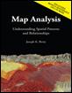
Previous discussion in Topic 5 introduced fundamental concepts and
procedures used in visual analysis. As a
quick review, recall that the algorithm uses a series of expanding rings to
determine relative elevation differences from the viewer position to all other
map locations. Elevation differences
that are less than those in previous rings are not seen.
The top portion of figure 1 illustrates the procedure. The ratio of the elevation difference (rise
indicated as striped boxes) to the distance away (run indicated as the
dotted line) is used to determine visual connectivity. Whenever the ratio exceeds the previous ratio,
the location is marked as seen (red); when it fails it is marked as not seen
(grey).
To conceptualize the procedure, imagine a searchlight illuminating portions of
a landscape. As the searchlight revolves
about a viewer location the lit areas identify visually connected
locations. Shadowed areas identify
locations that cannot be seen from the viewer (nor can they see the
viewer). The result is a viewshed
map as shown draped over the elevation surface in figure 1. Additional considerations, such as tree
canopy, viewer height and view angle/distance, provide a more complete
rendering of visual connectivity.
The top portion of figure 2 shows the viewsheds from
three different viewer locations. Each
map identifies the locations within the project area that are visually
connected to the specified viewer location.
Note that there appears to be considerable overlap among the “seen”
(red) areas on the three maps. Also note
that most of the right side of the project area isn’t seen from any of the locations
(grey).
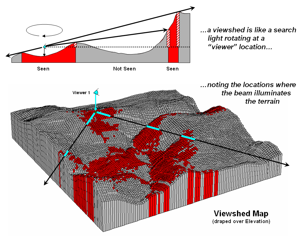
Figure 1. Calculating a
viewshed.
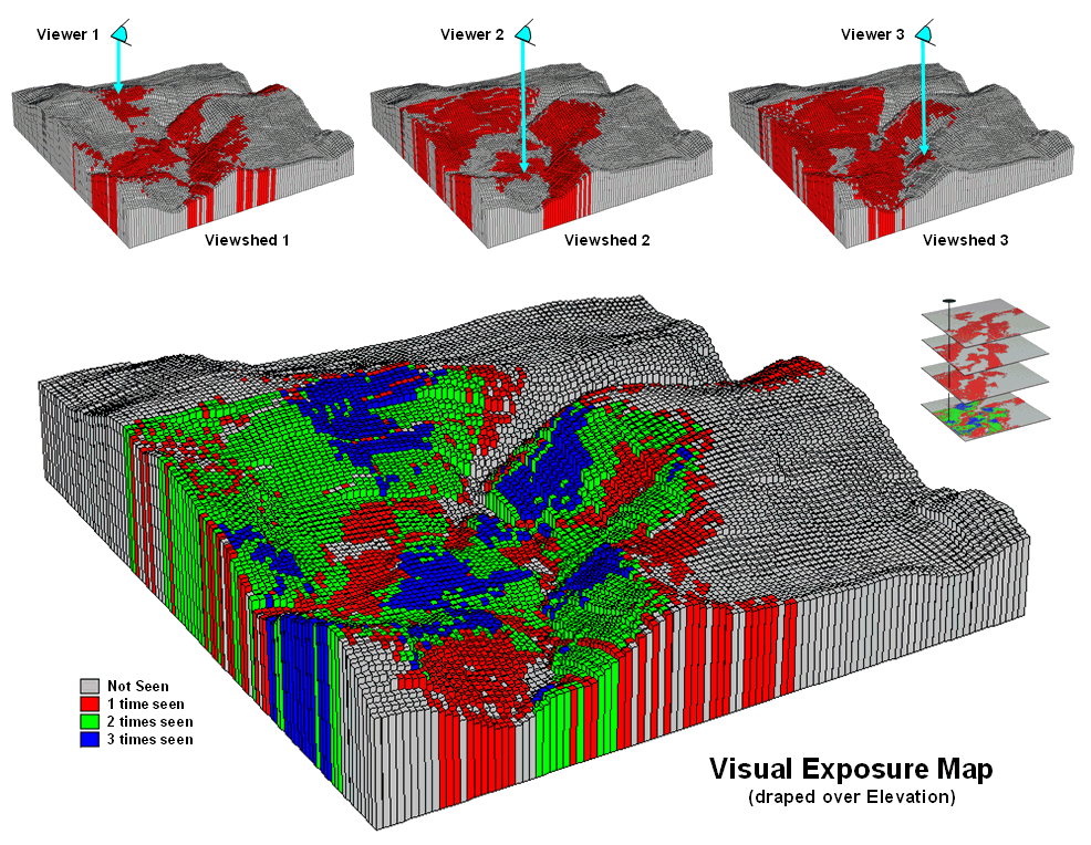
Figure 2. Calculating a
visual exposure map.
A visual exposure map is generated by noting the number
of times each location is seen from a set of viewer locations. I n figure 2
this process is illustrated by adding the three viewshed maps together. The resulting visual exposure map in the
bottom of the figure contains four values—0= not seen, 1= one time seen, 2= two
times seen and 3= three times seen—forming a relative exposure scale.
The top portion of figure 3 shows the result considering the entire road
network as a set of viewer locations. In
addition, the different road types are weighted by the number of cars per hour.
In this instance the total “number of cars” replaces the “number of times seen”
for each location in the project area.
Figure 3. Calculating a
visual vulnerability map.
The effect is that extra importance is given to road types having more
cars yielding a weighted visual exposure map. The relative scale extends from 0 (not seen;
grey) to 1 (one car-location visually connected; dark green) through 12,614
(lots and lots of visual exposure to cars; dark red). In turn, this map was reclassified to
identify areas with high visual exposure—greater than 5,500 car-locations
(yellow through red)—for a map of visual vulnerability.
A visual vulnerability map can be useful in planning and decision-making. To a resource planner it identifies areas
that certain development alternative could be a big “eyesore.” To a backcountry developer it identifies
areas whose views are dominated by roads and likely a poor choice for “serenity
acres.” Before visual analysis
procedures were developed, visceral visions of visual connectivity were
conjured-up with knitted-brows focused on topographic maps tacked to a
wall. Now detailed visual vulnerability
assessments are just a couple of clicks away.
Try Vulnerability Maps to Visualize Aesthetics
(GeoWorld, March
2003)
The previous section described procedures for characterizing visual
vulnerability. The approach
identified “sensitive viewer locations” then calculated the relative visual
exposure to the feature for all other locations in a project area. In a sense, a feature such as a highway is
treated as an elongated eyeball similar to a fly’s compound eye composed of a
series of small lenses—each grid cell being analogous to a single lens.
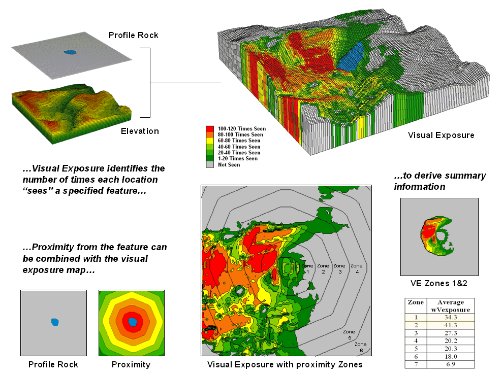
Figure 1. Visual connectivity to a map
feature (Profile Rock) identifies the number of times each location sees the
extended feature.
In figure 1, Profile Rock is composed of 120 grid cells positioned in
the center of the project area. In
determining visual exposure to Profile Rock, the computer calculates straight
line connectivity from one of its cells to all other locations based on its
relative position on the elevation surface.
Depending on the unique configuration of the terrain some areas are
marked as seen and others are not.
The process is repeated for all of the cells defining Profile Rock and a
running count of the “number of times seen” is kept for each map location. The top right inset displays the resulting
visual exposure from not seen (VE= 0; grey) to the entire feature being visible
(VE= 120; red). As you might suspect, a
large amount of the opposing hillside has a great view of Profile Rock. The southeast plateau, on the other hand,
doesn’t even know it exists.
The lower portion of figure 1 extends on the concept of visual exposure
by introducing distance. It is common
sense that something near you (foreground) has more visual impact than
something way off in the distance (background).
A proximity map from the viewer feature is generated and distance zones
can be intersected with the visual exposure map (lower-right inset in figure
3). The small map on the extreme right
shows visual exposure for just distance Zones 1 and 2 (600m reach). The accompanying table summarizes the average
visual exposure to Profile Rock within each distance zone—much higher for Zones
1 and 2 (34.3 and 41.3) than the more distant zones (27.3 or less).
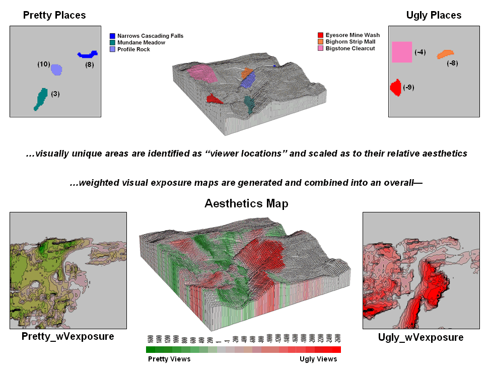
Figure 2. An aesthetic map determines the
relative attractiveness of views from a location by considering the weighted
visual exposure to pretty and ugly places.
The ability to establish weighted visual exposure for features is
critical in deriving an aesthetic map. In this application various features are
scaled in terms of their relative beauty— 0 to 10 for increasing pretty places
and 0 to -10 for increasing ugly places.
For example, Profile Rock represents a most strikingly beautiful natural
scene and therefore is assigned a “10.”
However, Eyesore Mine wash is one of the ugliest places to behold so it
is assigned a “-9.” I n calculating weighted visual exposure, the aesthetic value
at a viewer location is added to each location within its viewshed. The result is high positive values for
locations that are connected to a lot of very pretty places; high negative
values for connections to a lot very ugly places; zero, or neutral, if not
connected to any pretty or ugly places or they cancel out.
The top portion of figure 2 shows the aesthetics ratings for several
“pretty and ugly” features in the area as 2D plots then as draped on the
terrain surface. The 2D plots in the
bottom portion of the figure identify the total weighted visual exposure for
connections from each map location to pretty and ugly places.
The overall aesthetic map in the center is analogous to calculating net
profit—revenue (think Pretty) minus expenses (think Ugly). It reports the net aesthetics of any location
in the project area by simply adding the Pretty_wExposure
and Ugly_wExposure maps. Areas with negative values (reds) have more ugly
things within their view than pretty ones and are likely poor places for a
scenic trail. Positive locations
(greens), on the other hand, are locations where most folks would prefer to
hike.
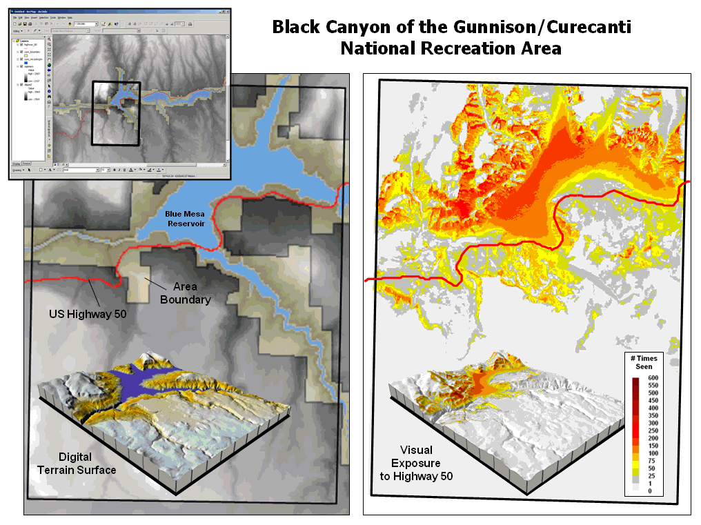
Figure 3. Weighted visual
exposure map for an ongoing visual assessment in a national recreation area.
Real-world applications of visual assessment are taking hold. For example, a senior honors thesis project
is underway at the University of Denver by a student intern with the National
Park Service (see author’s note). The
project will develop visual vulnerability maps from the reservoir in the center
of the park and a major highway running through the park (right side of the
figure 3). In addition, aesthetic maps
will be generated based on visual exposure to pretty and ugly places in the
park.
It seems to be a win-win situation with the student getting practical
___________________
Author’s Note: Senior Honors Thesis by University of Denver Geography
student Chris Martin, 2003.
(Back to the Table of Contents)